Images #
Display images with:
include image syntax #
This is our in-house and preferred image syntax.
This syntax provides a screenshot attribute that places a single pixel border
around the image, which is best used for screenshots that have white space up to
their edges, so that the image is clearly delineated from the page’s text.
This syntax also allows you to specify valid CSS to tailor a particular image.
If no pxwidth value is passed, the image defaults to the file’s inherent width
up to a maximum of 90% of the current container for very large images.
Another option of the include image syntax is to turn very large images into
two-size modal images. The specified image is reduced for normal display on the
page, limited to pxwidth size, but the image is also now a button. When
clicked, the image expands and is shown in a larger modal window. The
screenshot and modal options are mutually exclusive; use one or the other.
Use include image.html in a separate tag block with the parameters shown in
the following table:
* Parameters may be used in any order.
| Key | Value | Required | Notes |
|---|---|---|---|
| url | Relative path to the asset. | Required | |
| alt‑text | String for alt tag content. | Required | |
| descr | String for description tag content for accessibility support. | Optional | Use if alt‑text does not convey enough information |
| pxwidth | Width value in pixels, integer only. See the notes below | Optional | |
| screenshot | Set to ‘true’ adds 1px solid border. No effect if modal. | Optional | |
| modal | Set to ‘true’ adds modal ability. | Optional | Must assign img‑id if true |
| img‑id | Adds ID string. | Optional | Required for modal. Must be unique per page. |
| style | Pass any valid CSS to the image. | Optional |
For the pxwidth key:
- Don’t include a
pxwidthline, or leave its value empty to specify using the native image resolution by default.pxwidth='' - Do not specify
pxwidth='0', which disables the image. - For modal,
pxwidthspecifies the non-modal display size on the page before expansion.
Using within lists #
When using the include image within a list, you must prefix the include
image tag block with a and the proper indentation in order to ensure
correct alignment. If no is used, the list items after the include
image will start over at 1.
1. The first item in the list

    {% include image.html ... %}

2. The second item in the list

  1. The first item in a nested list

      {% include image.html ... %}

  2. The second item in a nested list

3. The third item in a list
Copy these images #
Feel free to copy the include tag blocks that display the following images. Paste these as templates into your working documents, then edit as appropriate:
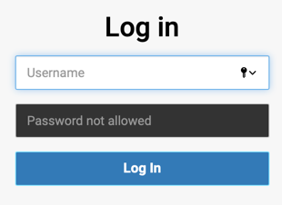
{% include image.html
  url='../assets/img/general/web-ui-login.png'
  img-id='webuilogin'
  alt-text='WebUI login dialog'
  descr-text='Image depicting WebUI login dialog'
  pxwidth='250'
  screenshot='true'
%}
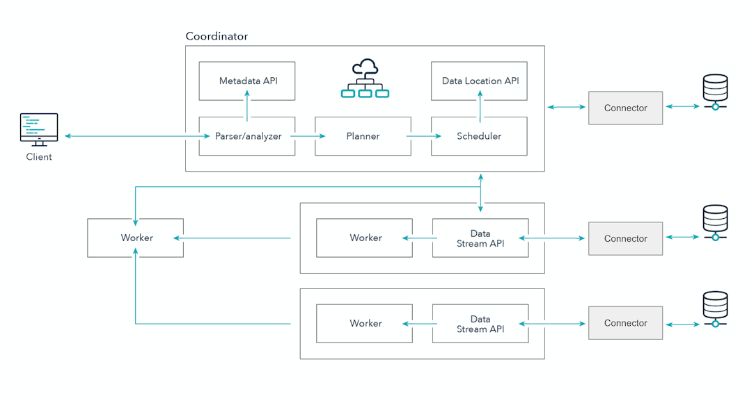
{% include image.html
  url='../assets/img/general/data-engg-schematic-overview.png'
  img-id='des'
  alt-text='Starburst cluster overview'
  descr-text='Image depicting Starburst architecture'
  pxwidth='650'
  modal='true'
%}
HTML syntax #
This syntax allows you to add further tweaks such as sizing. If you copy this
example, remember to surround site.baseurl with double open and close brace
{ } characters.
<img src="site.baseurl/assets/img/logo/starburst.png" alt="Starburst logo"
description="Starburst Logo" width="200"/>
Markdown syntax #
Only for very simple image cases, use Markdown syntax, which is:
. Use a relative path to the image from the
current location, or use the site.baseurl substitution token. (If you copy
the following example, remember to surround site.baseurl with double open and close
brace { } characters.)

Logos #
The following conditions should be met when optimizing and saving brand logos to use on the site:
| Property | Value |
|---|---|
| Bounding | Trim/Cropped |
| Width | 400px |
| Height | Auto (Constrained proportions) |
| Background | Transparent |
| Format | PNG |
| Example |  |
When adding a brand logo to the beginning of a page, for example the Red Hat marketplace page, the initial content section should contain the logo using the following HTML structure:
<div class="row-with-logo">
  <div markdown="1" class="row-with-logo-text-container">
    <-- Add text content here -->
  </div>
  <div class="row-with-logo-image-container">
    <img
      class="img-fluid"
      src="../assets/img/logo/dbeaver.png"
      alt="{{page.title}}"
    />
  </div>
</div>
Similarly, the image.html include may also be used by changing the HTML
snippet above to:
<div class="row-with-logo">
  <div markdown="1" class="row-with-logo-text-container">
    <-- Add text content here -->
  </div>
  <div class="row-with-logo-image-container">
    {% include image.html
      url='../assets/img/logo/dbeaver.png'
      alt-text='DBeaver Logo'
    %}
  </div>
</div>
This HTML structure ensures that the logo will be placed to the right of the content, creating a two column layout that allows the text to not produce a staggered wrapping effect. Once a certain breakpoint has been reached the logo will then move to above the text content.
All content after the above HTML snippet will take up the full width of the container.
Icons #
The Starburst documentation site uses Google Material icons. If you find a Font Awesome icon, create a pull request to replace it with the appropriate Google Material icon.
If the icon you want to use is not in the table of icons used, find the appropriate Google Material icon and include the following class and necessary styling.
Use the material-symbols-rounded class:
<i class="material-symbols-rounded">share</i>
Output:
share
To change the color of an icon or adjust styling, use the style attribute:
<i class="material-symbols-rounded"
      style="color:#b835a1">share</i>
Output:
share
Icons used #
The following is a list of all Google Material icons used in the documentation.
| Icon | Icon code |
|---|---|
| more_vert | <i class="material-symbols-rounded"
style="color:black">more_vert</i> |
| more_vert | <i class="material-symbols-rounded"
style="color:var(--fusion-fuchsia)">more_vert</i> |
| arrow_upward | <i class="material-symbols-rounded"
style="color:black">arrow_upward</i> |
| arrow_downward | <i class="material-symbols-rounded"
style="color:black">arrow_downward</i> |
| open_in_new | <i class="material-symbols-rounded"
style="color:black">open_in_new</i> |
| toggle_on | <i class="material-symbols-rounded"
style="color:#b835a1">toggle_on</i> |
| do_not_disturb_on | <i class="material-symbols-rounded"
style="color:#b835a1">do_not_disturb_on</i> |
| delete | <i class="material-symbols-rounded"
style="color:red">delete</i> |
| edit | <i class="material-symbols-rounded"
style="color:black">edit</i> |
| chevron_right | <i class="material-symbols-rounded"
style="color:black">chevron_right</i> |
| keyboard_arrow_down | <i class="material-symbols-rounded"
style="color:black">keyboard_arrow_down</i> |
| notifications | <i class="material-symbols-rounded"
style="color:black">notifications</i> |
| menu | <i class="material-symbols-rounded"
style="color:black">menu</i> |
| content_copy | <i class="material-symbols-rounded"
style="color:black">content_copy</i> |
| content_copy | <i class="material-symbols-rounded"
style="color:#b835a1">content_copy</i> |
| apps | <i class="material-symbols-rounded"
style="color:black">apps</i> |
| apps | <i class="material-symbols-rounded"
style="color:#b835a1">apps</i> |
| view_list | <i class="material-symbols-rounded"
style="color:black">view_list</i> |
| view_list | <i class="material-symbols-rounded"
style="color:#b835a1">view_list</i> |
| lock | <i class="material-symbols-rounded"
style="color:black">lock</i> |
| cached | <i class="material-symbols-rounded"
style="color:#b835a1">cached</i> |
| arrow_circle_down | <i class="material-symbols-rounded"
style="color:black">arrow_circle_down</i> |
| arrow_circle_left | <i class="material-symbols-rounded"
style="color:#b835a1">arrow_circle_left</i> |
| arrow_circle_right | <i class="material-symbols-rounded"
style="color:#b835a1">arrow_circle_right</i> |
| schema | <i class="material-symbols-rounded"
style="transform: rotate(-90deg)">schema</i> |
| table | <i class="material-symbols-rounded">table</i> |
| visibility | <i class="material-symbols-rounded">visibility</i> |
| bottom_sheets | <i class="material-symbols-rounded"
style="transform: rotate(-90deg)">bottom_sheets</i> |
| radio_button_checked | <i class="material-symbols-rounded"
style="color:green">radio_button_checked</i> |
| radio_button_checked | <i class="material-symbols-rounded"
style="color:gray">radio_button_checked</i> |
| radio_button_checked | <i class="material-symbols-rounded"
style="color:red">radio_button_checked</i> |
| search | <i class="material-symbols-rounded">search</i> |
| check_circle | <i class="material-symbols-rounded"
style="color:green">check_circle</i> |
| error | <i class="material-symbols-rounded"
style="color:red">error</i> |
| help | <i class="material-symbols-rounded"
style="color:gray">help</i> |
| subdirectory_arrow_right | <i class="material-symbols-rounded"
style="color:black">subdirectory_arrow_right</i> |
| code | <i class="material-symbols-rounded"
style="color:#b835a1">code</i> |
| fullscreen | <i class="material-symbols-rounded"
style="color:#b835a1">fullscreen</i> |
| check | <i class="material-symbols-rounded"
style="color:green">check</i> |
| close | <i class="material-symbols-rounded"
style="color:red">close</i> |
| add | <i class="material-symbols-rounded"
style="color:#b835a1">add</i> |
| share | <i class="material-symbols-rounded"
style="color:#b835a1">share</i> |
| videocam | <i class="material-symbols-rounded">videocam</i> |
| settings | <i class="material-symbols-rounded">settings</i> |
Persona based icons #
Platform administrator
Data consumer
Data engineer
Topic based icons #
Admin
Catalog
Clients
Clusters
Connectors
Data sources
Deploying
Migration
Performance tuning
Query performance
Is the information on this page helpful?
Yes
No